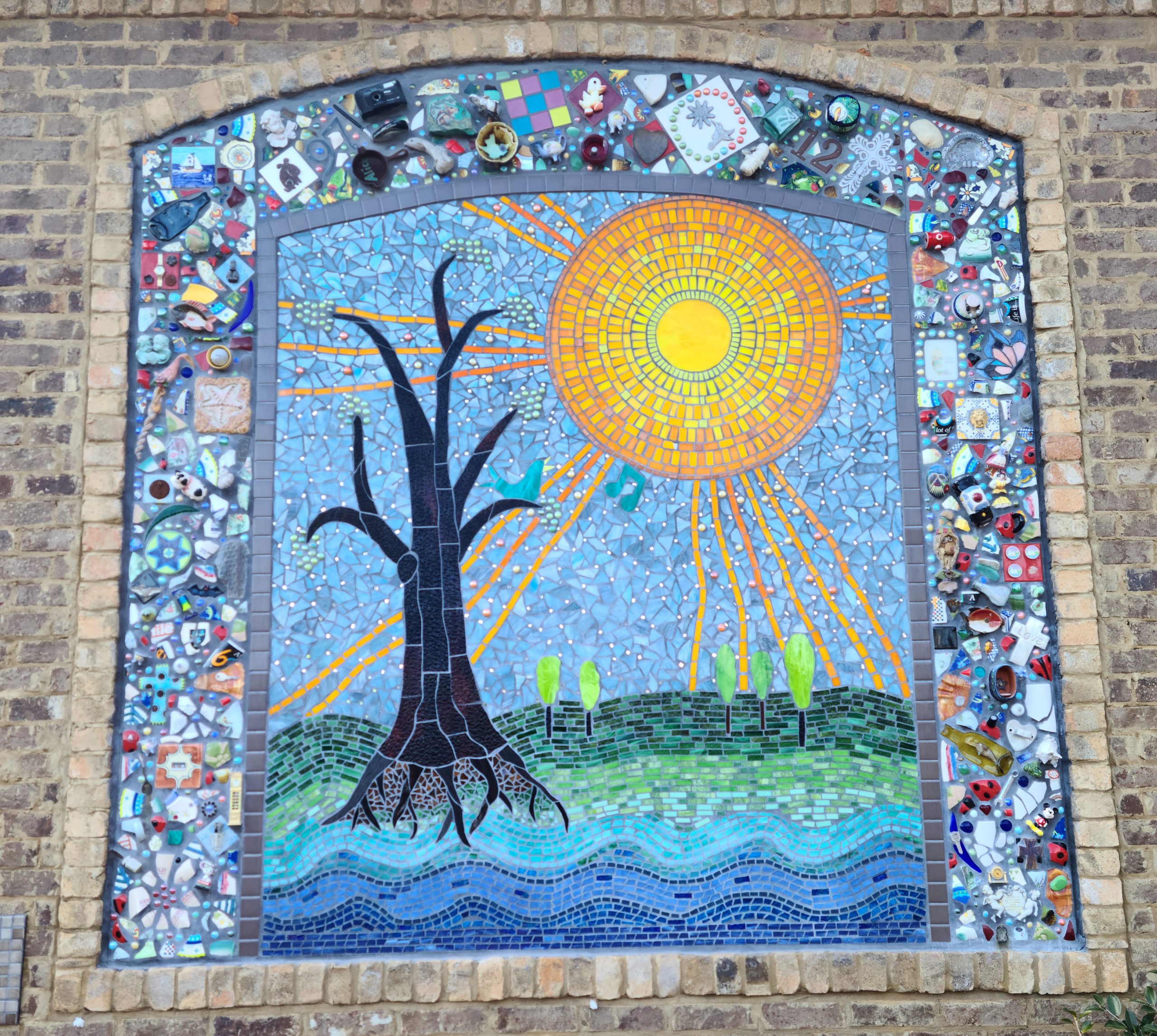
Artists Rhys Greene and Linda Muñoz created this rather unique mural for Caring Days adult day care. The scene in the middle of the tree is actually a mosaic made up of a huge amount of tiny pieces of glass and stone. Around the outside is a sort of collage of various objects. A few crosses here, a toy car and ship in a bottle there. In my mind, those objects represent the passions of those inside the day care. Perhaps earlier in their life, one of the people inside collected cars or had a knack for braving the open ocean.
Regardless of the meaning, this mural is a one-of-a-kind installation that is worth visiting.
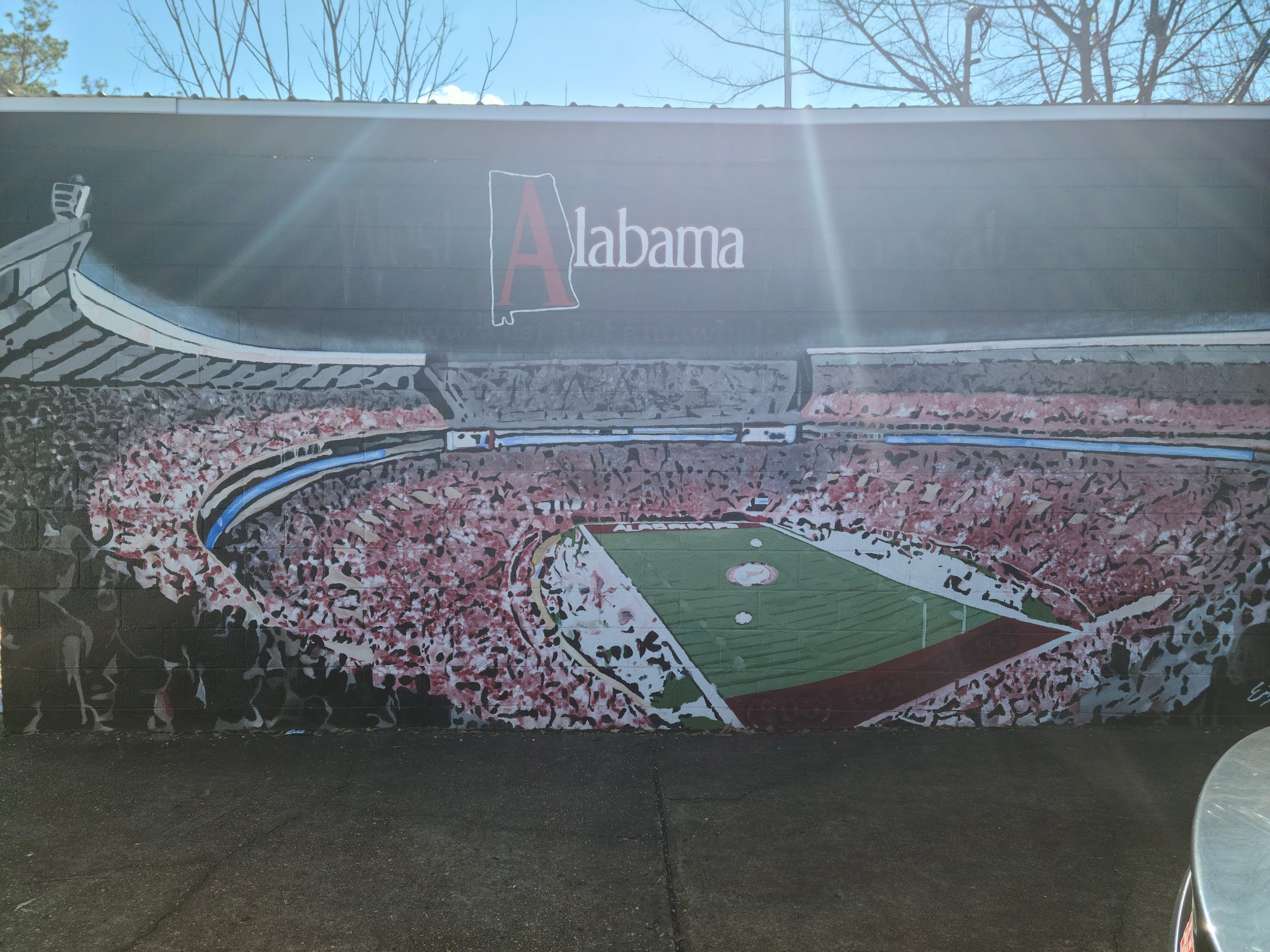
Now for something you might be a bit more familiar with: the iconic Bryant-Denny Stadium. This mural, located next to RNC Auto Sales on 15th Street, is artist Eric Griffin’s handiwork. At a glance, the realism of the mural shines to the point where it could be mistaken for a photograph. Upon closer inspection, though, you can see that the “fans” in the crowd are mostly nothing more than dots of paint. Griffin’s choice to do so makes the crowd blend together into a sea of red and white.
That image of a sea at high tide captures the feeling of being in the middle of a sold-out, rocking Bryant-Denny Stadium very well. Your cheers become a single note in a giant symphony.
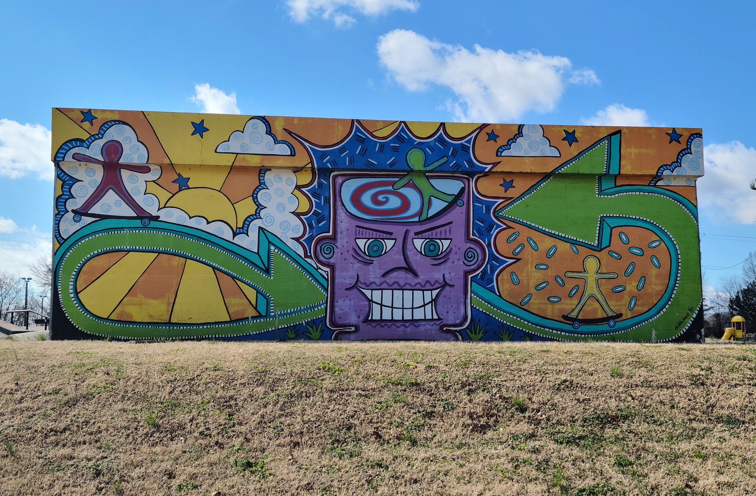
Debbie Lewis has provided visitors of Palmore Park with this fun mural on the back side of a drop-in at the skate park. This mural of hers compresses the intensity and joy of a skate park into a single image, from the skaters rolling down the green arrows to the grinning figure in the middle. That expression it is wearing reminds me of the look on skaters’ faces after they land a trick that leaves the rest of the park in awe. It is somewhere between happiness, a realization that they just “did that,” and relief.
The bright colors and action presented in the mural make this a perfect addition to Palmore Park as a whole, but especially the skate park.
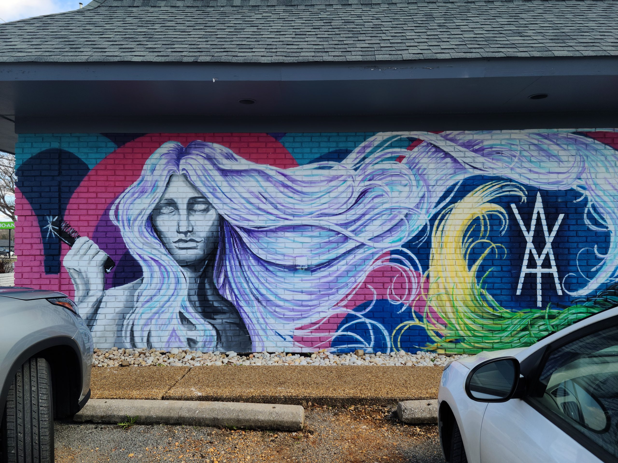
Artist Sean Gilder has definitely given customers of the Alex Yarber Salon something to look at before they walk in. The detail on the hair, as well as the rainbow of different colors in the hair, helps potential customers understand what the salon is all about and reminds returning customers why they keep coming back.
The other side of the mural actually has another girl with multicolored hair, the tips of which you can see peeking in from the right side of the image. I could not find a way to fit it into my picture because of the dimensions of the building. The size of this mural is something that needs to be seen in-person. It is absolutely worth it.
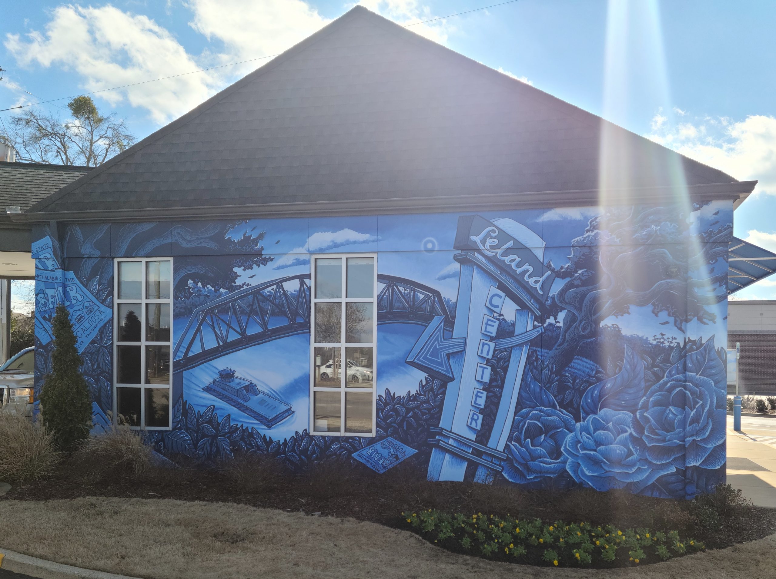
The bank might be one of the last places you expect to see an experimental mural on an entire wall, but artist Banks Compton has done exactly that to this Alabama ONE Credit Union. The monochromatic nature of the mural helps disguise the details of the image until you get closer to the building, something I assume was done purposefully to avoid too much attention being drawn to the bank. I actually missed it on my first drive by the bank.
Once you do take a closer look, though, all the details pop in a very calm and dignified way. It also calls back to some famous parts of Tuscaloosa’s history, which further cements this mural as a great accomplishment.
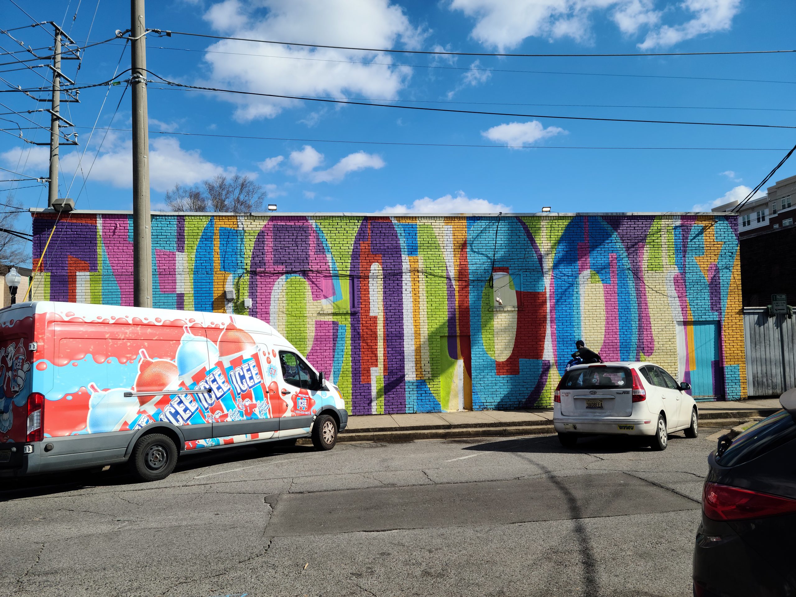
And finally, we have artist Jason Tetlak’s mural on the side of Egan’s on the strip. Of all the murals on this list, Tetlak’s is the closest to campus. You probably have seen it before. However, you might not have seen it in its entirety. After looking into Tetlak’s own comments on the installation, there is more to this mural than meets the eye.
When viewing this mural through a red lens, the “Tuscaloosa” on the mural vanishes and is replaced with “The Druid City.” Of course, “Druid City” is an alternate name for Tuscaloosa. This small detail makes this mural worth viewing again and again.
